Mobile Version Of WordPress Site To Load Faster By Server Detection
 By Faruque Ahamed Mollick
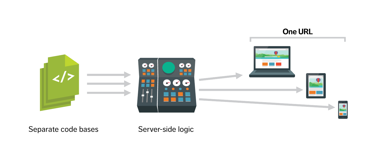
Today almost every WordPress blogger prefer a responsive theme and they think responsiveness is a nice way to fit their website for mobile and tablets devices. Well according to me also it is really good and bootstrap also help WP theme developers and designers to make a theme responsive quickly. But do you know that there is a problem using responsive theme. Well Facebook, Amazon, Fiverr.com does not using the usual responsiveness features for their websites to work with mobile. They have completely different version of their website for mobile and tablets devices.
What is the problem of responsive websites?
If you want to hide some content for mobile on responsive website than what will you do? You will make it hidden by CSS. But do you know that mobile and tablets devices also load the content that is hidden by CSS. Thus though you can not see those contents, but it consume memory for that content. Thus your website on mobile also take the same memory size as you can see on desktop or PC. You have no benefit to load your site faster than desktop and it browse the same memory size like desktop. But for a device with small size of screen it is expected to consume less memory or data to load the site faster just like Facebook, Amazon, Fiverr.com do when you browse these site on mobile. Also a wasted of data consume for those part which are hidden by CSS. This is really a problem.
Also your blog will load the unnecessary CSS, JavaScript for mobile devices and the memory size of images also large like you can see on your desktop version site. If the unnecessary CSS, JS and would not load and also if the image size decreases its memory then your site would be more faster for mobile devices. These are the problems of making your WordPress blog responsive.
So what to do to solve this problem?
A nice solution to solve this problem is server side detection of devices. You can stop loading all the unnecessary content, CSS file, JavaScript files and also can choose the low memory size images to make your site faster on mobile. Or you can do just like I have done for my EyeSwift blog. Completely load the different template files for mobile and create different CSS, JS file which are simpler and low memory size than those that used by desktop and include it with the template files created for mobile devices only. Now all the magic will be done by the mobile divice detecting function that WordPress already has. It is wp_is_mobile() function that you have to use Just like that you can see in the code below:
<?phpif( wp_is_mobile() ) {/* Display and echo mobile specific stuff here */}?>
And use different template files by this function – get_template_part( 'nav' ); .
For example, if you want to load a different template file for header of your themes then write the code like this:
<?phpif( !wp_is_mobile() ) { //If is desktop/* Header code for desktop */}else {get_template_part('mobile/header-mobile');}?>
Using the same code you can do it for all of your template files. And inside the header for mobile add the simple and low memory size of CSS code for mobile.
How to load the low memory size images for mobile and tablets?
If you are using the_post_thumbnail( ‘large’ ); or the_post_thumbnail( ‘full’ ); to show the featured image then you can use the_post_thumbnail( ‘medium’ ); to show medium size of featured image or the_post_thumbnail( ‘thumbnail’ ); to show the small thumbnail and you will get the low memory size of images.
Conclusion
So you can see that just by using a simple function on WordPress to detect mobile and tablets you can do a lots of more. Even you can completely change the looks of your WordPress site with it. And it is always better to load a website faster for mobile.
Leave a Reply